Color Theory
Color Theory was a multi-phase exploration of how color can communicate emotion, meaning, and cultural narratives through both digital and physical experimentation. Moving between abstract emotional interpretation, technical color relationships, and material studies, the project investigated how hue, saturation, brightness, opacity, and composition influence perception and emotional response. Through a process that combined analog swatching, digital manipulation, and layered physical constructions, the work gradually evolved into a study rooted in the visual language of Persian carpets and their rich symbolic relationship with memory, power, adolescence, and craftsmanship.
Emotional Translation Through Color
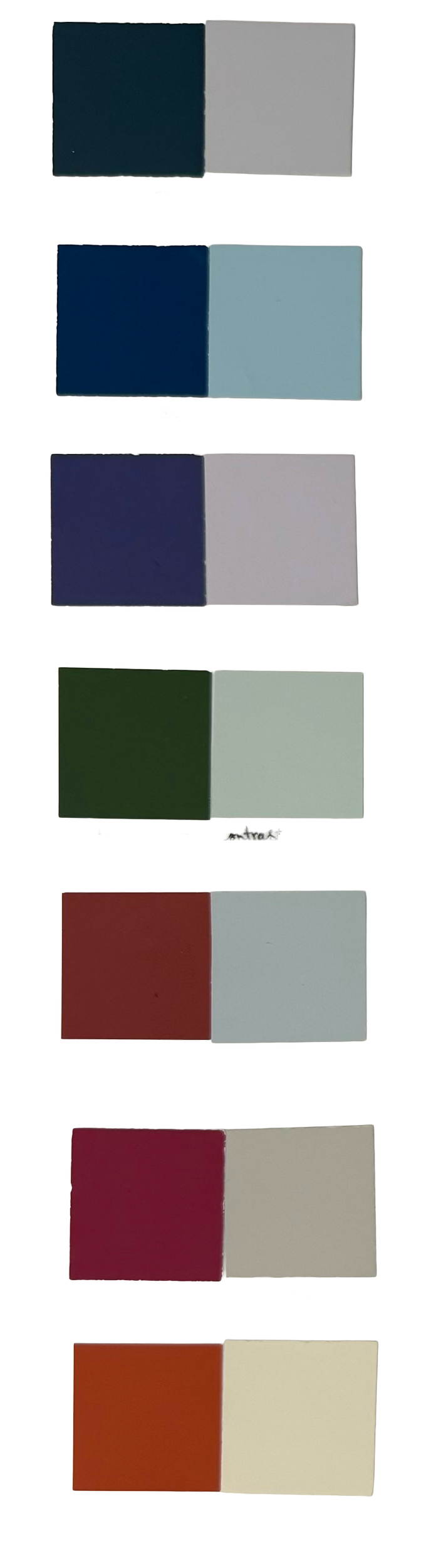
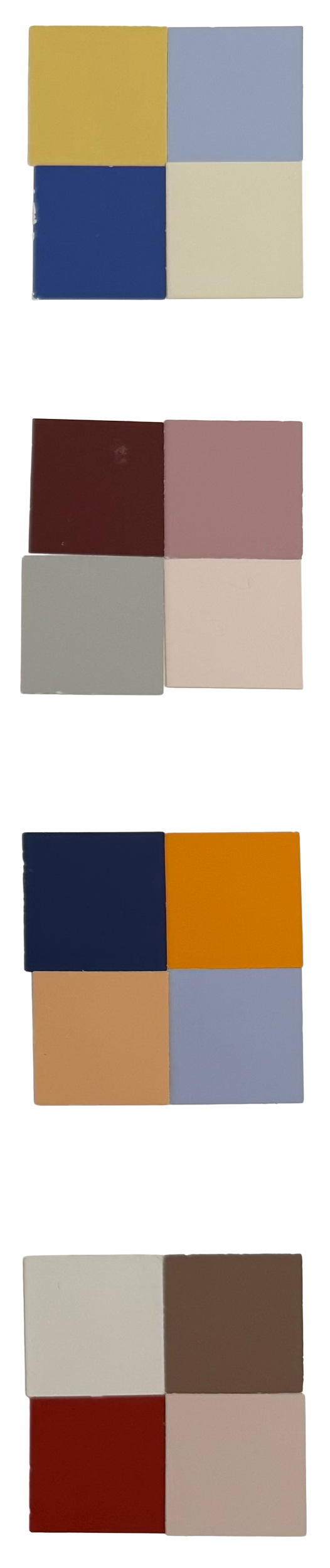
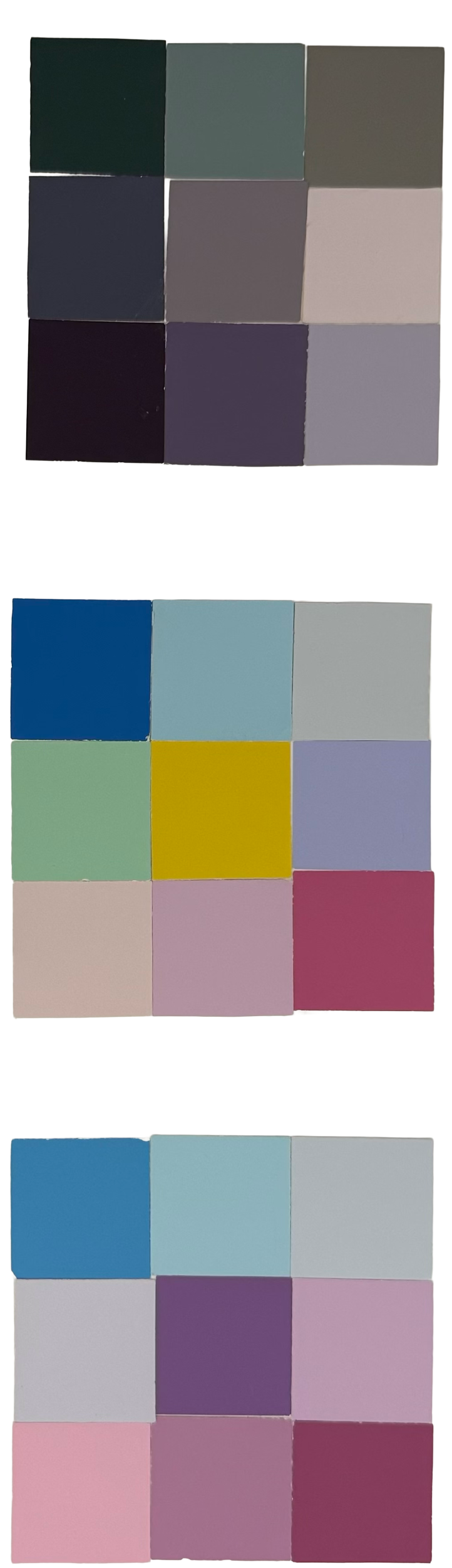
The project began by selecting two emotional experiences: Adolescence and Power and translating them into color palettes through studies of contrast and harmony. Through multiple physical swatch iterations, I explored how saturation, brightness, warmth, and tonal relationships could communicate emotional qualities such as transition, sensitivity, authority, strength, and elegance.
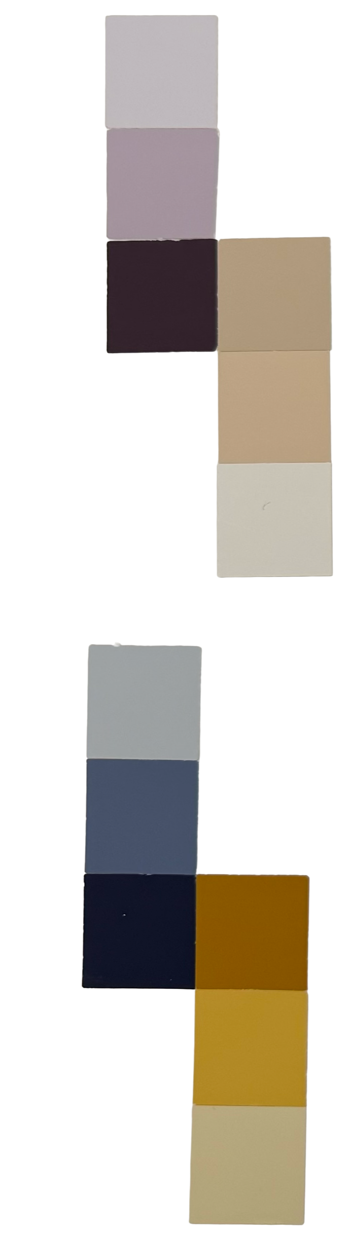

Adolescence

Contrast & Harmony
Hue and Value Contrast
Split Complimentary
Digital Color Exploration
After developing the physical swatches, the project transitioned into a digital workflow using Adobe Illustrator. This phase allowed greater flexibility in manipulating hue, saturation, brightness, and transparency relationships with much more precision.
By translating the physical swatches into digital compositions, I was able to refine subtle color interactions and study how small adjustments could dramatically change emotional perception. The process also introduced deeper exploration of color wheel relationships, harmony systems, and compositional balance.
The final outcome of this phase was two refined four-swatch palettes representing Adolescence and Power, each developed through continuous experimentation with color interaction and visual hierarchy.
Power
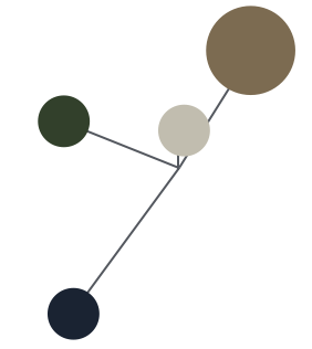

Contrast & Harmony
Value and Saturation Contrast
Analogous
Power
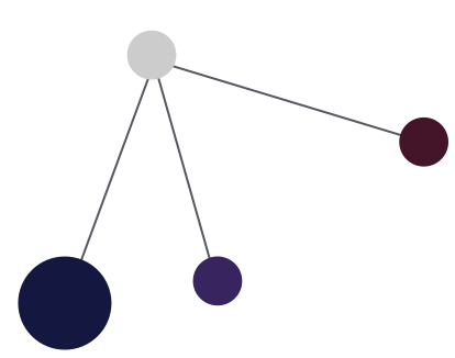

Contrast & Harmony
Hue and Value Contrast
Analogous
Semantics, Culture, and Persian Carpet
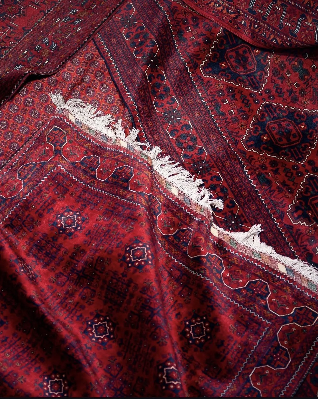
As the project evolved, I searched for a cultural and visual intersection between Adolescence and Power, which led me to Persian carpets. Rich in color, craftsmanship, and symbolism, Persian carpets became a meaningful reference point for both themes.
Traditionally handwoven with immense patience and precision, they have long represented prestige, artistry, and cultural value. At the same time, many carpets were woven by young women from adolescence into adulthood, embedding growth, time, and lived experience into the work itself. This relationship between maturation, labor, and refinement made Persian carpet a strong visual and conceptual bridge between the two emotional themes.
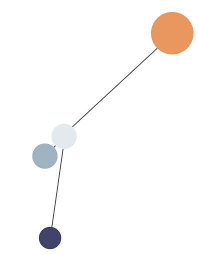
For the digital exploration, I selected a Bakhtiari Persian carpet and extracted two dominant colors from its composition:
• deep blue (#1b0d3f)
• red (#be2543).
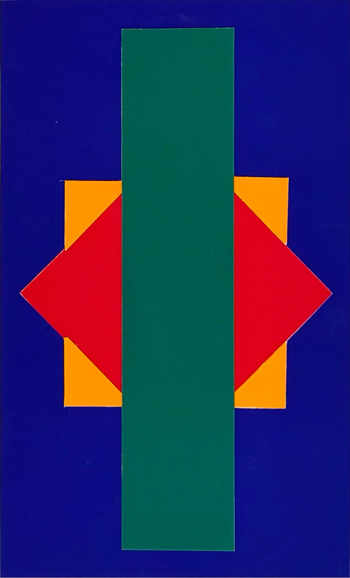
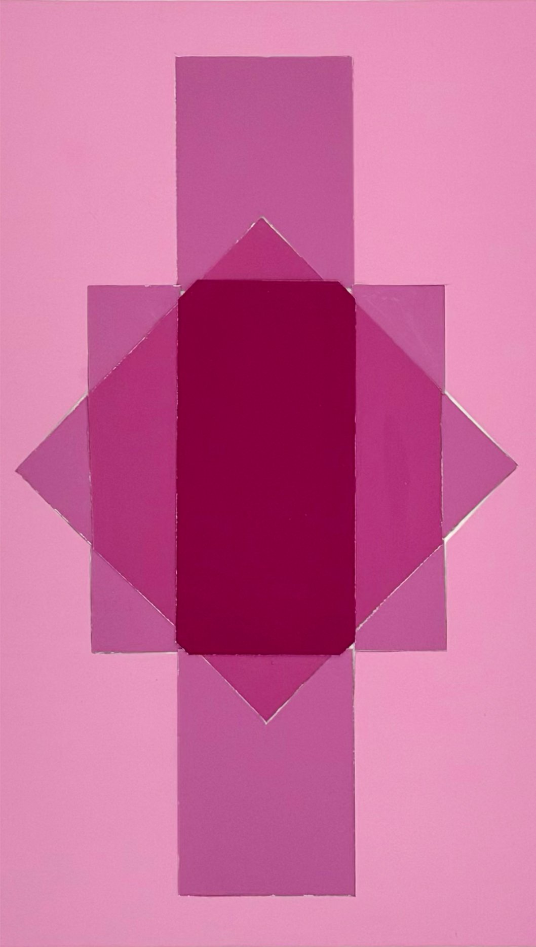
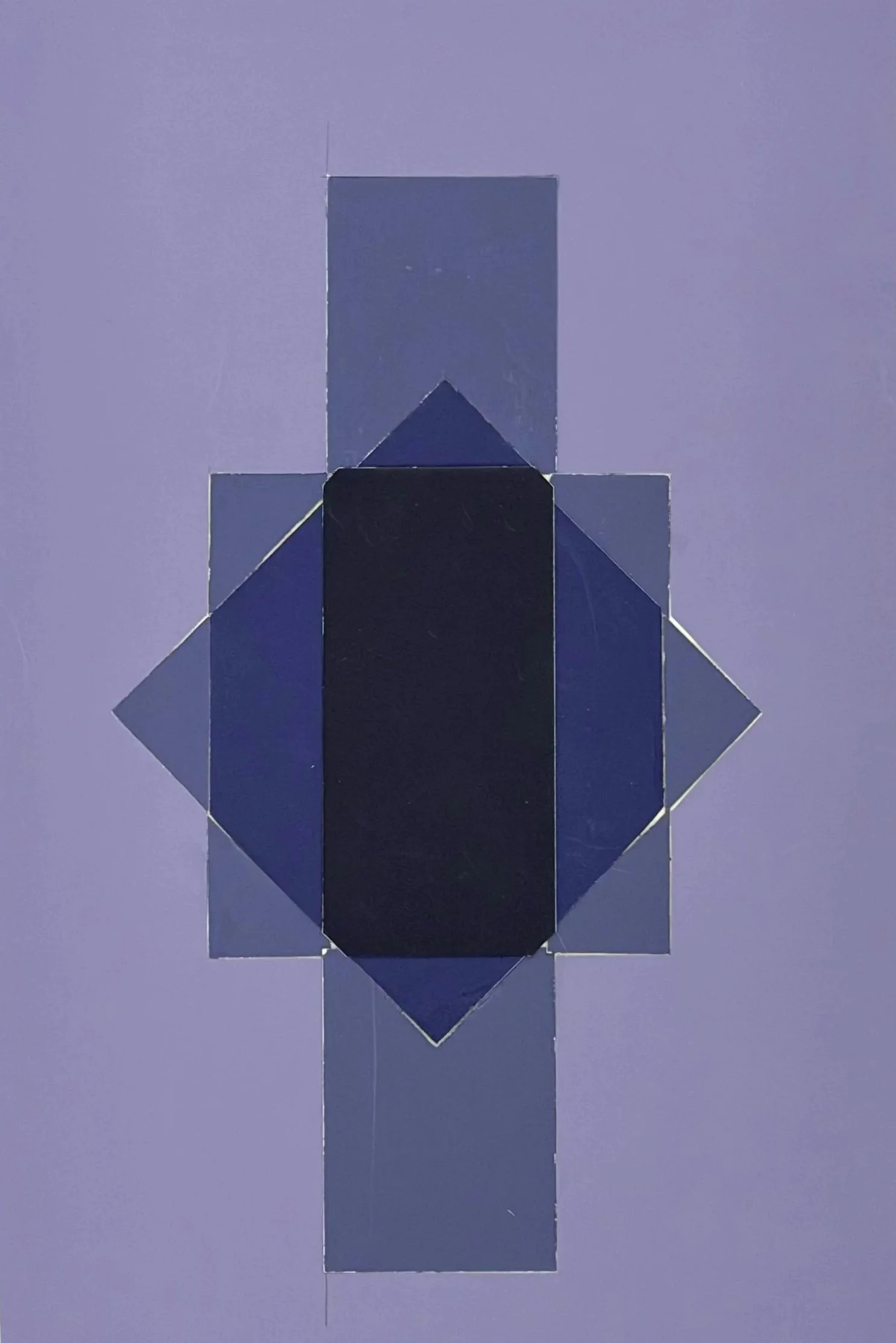
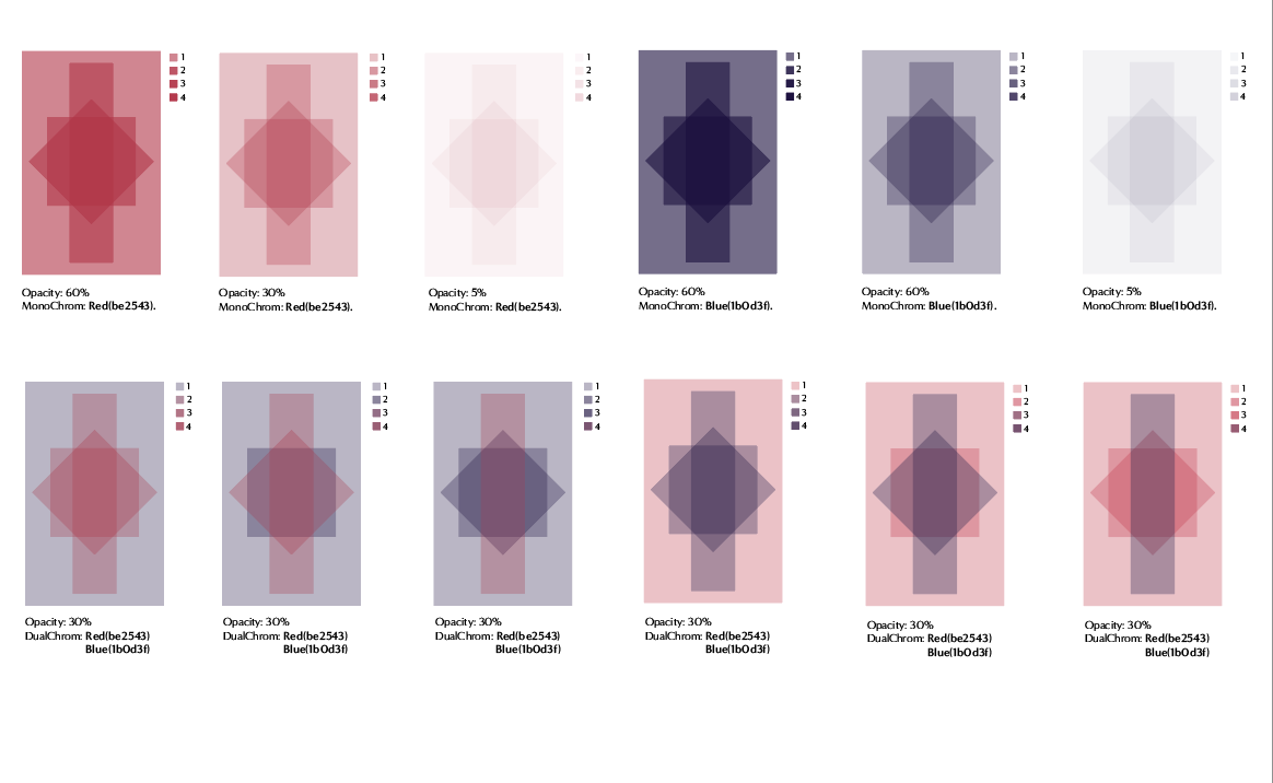
Inspired by the carpet’s geometric motifs, I created abstract layered forms in Adobe Illustrator and experimented with different opacity levels to study how overlapping colors could generate new tones, depth, and visual relationships.
Digital Motif Exploration
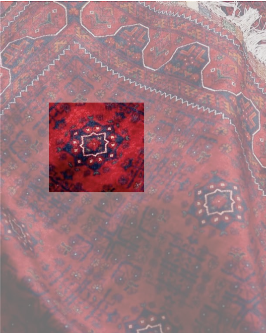
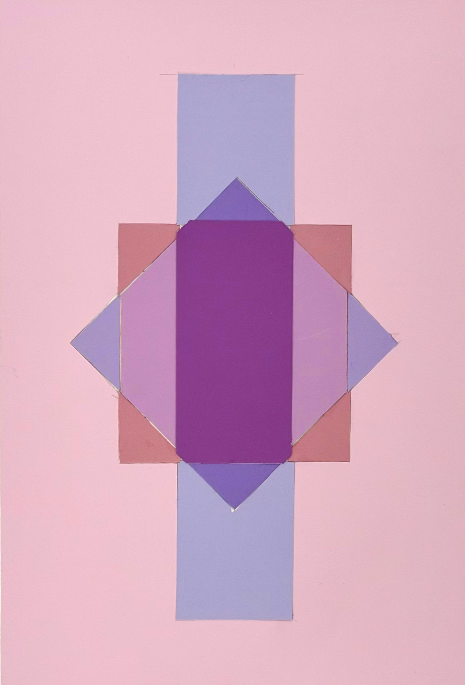
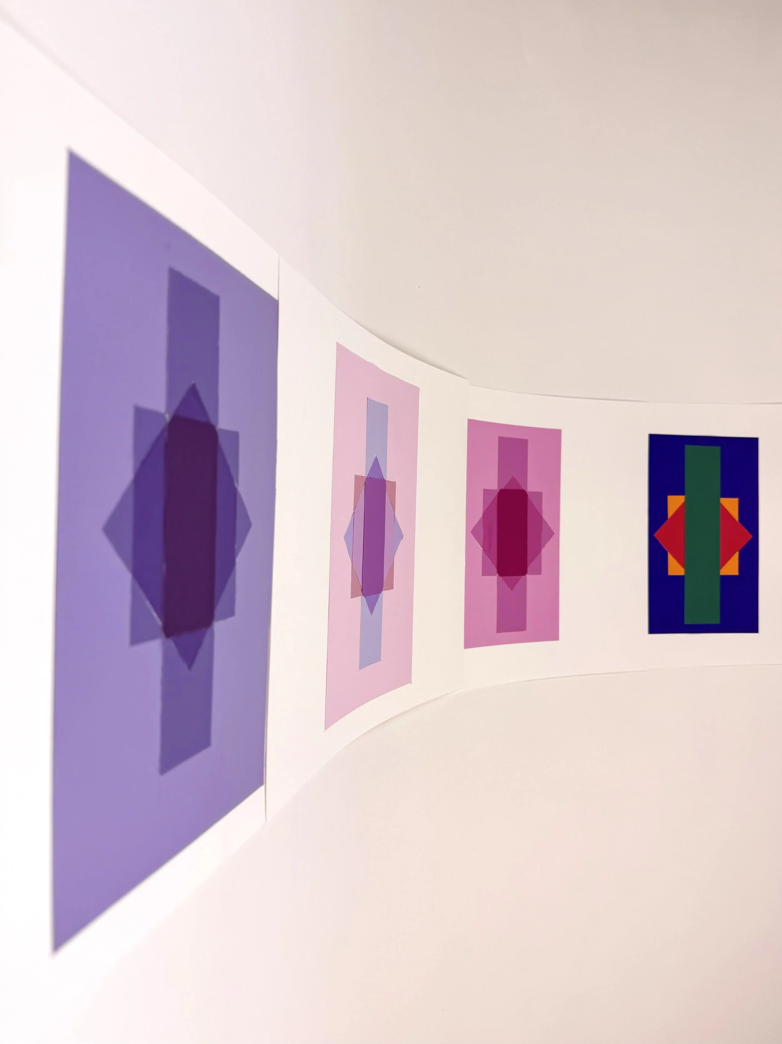
In the final phase, I translated the digital opacity studies back into physical form using Color-aid sheets. By carefully cutting and layering colors, I attempted to recreate the same visual blending and transparency effects seen on screen. This process became an exploration of how digital color interactions can be physically reconstructed through precision, observation, and material layering.
Physical Layer Studies